website copy
for an online print brokerage
Brief:
Research the particular artist and specific work allocated; position the series within their career, provide adequate context and produce copy for the prints’ acquisition landing page.
Working methodically, and after scrupulous exploration into the artists’ living situation, I assembled concise and detailed copy about each work assigned. Describing visual work by way of written words requires the correct balance of colourful descriptive language and simple reporting. Below are a few excerpts of different artists and prints within a series.
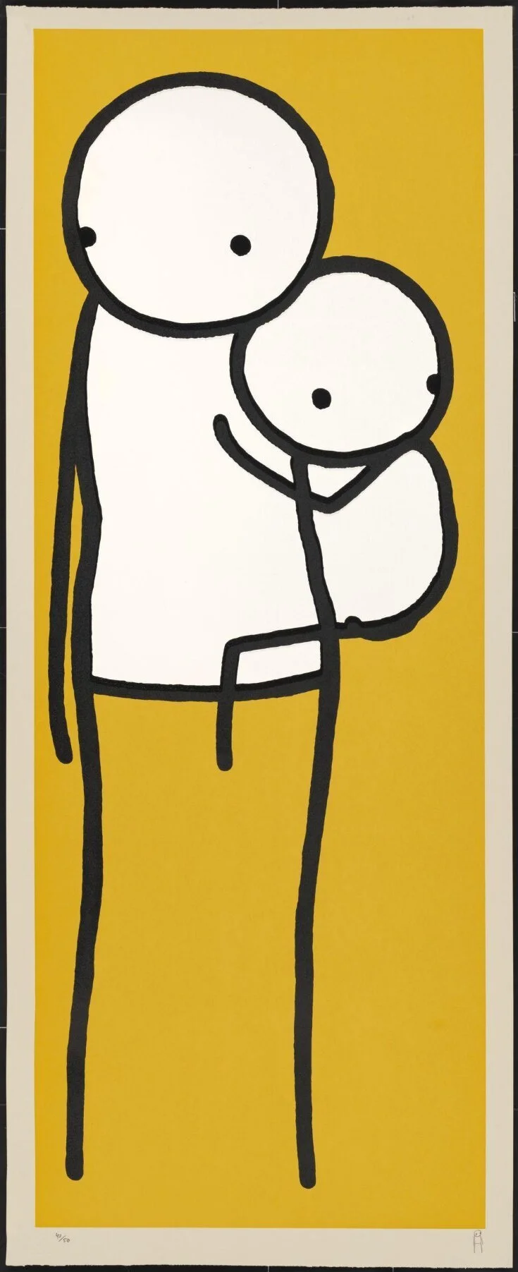
Single Mum, 2011, Stik
‘Stik’, Single Mum (yellow) - Critical review
“Single Mum (yellow) depicts a standing stick figure embracing a smaller figure clinging to its side. Printed in 2011, this signed tri-colour screen print on Somerset Card is an edition of 50. A formative piece in Stiks body of work, Single Mum (yellow) is an exemplary print in terms of his compositions of either lone figures, or duos. The standing figure is quietly static, despite an imbalance of weight accentuated by the diverging gazes of both figures. A sense of disquietude can be felt from this outward and opposite directional focus; while equally, a calming comfort can be inferred from the figures’ closeness and maternal bond. The vibrancy of the yellow backdrop can be seen in many of Stiks other stick figure prints, and carry through a nod to simplicity and directness of Street Art and its existence reflecting reality as he says, “The street is like a theatre”. Like Stiks other six-line stickmen in his Standing Figure series, there seems to be a consistent vulnerability and sense of isolation conveyed through the seemingly non- expressive faces and fixed statures; reflecting the nature of urban habitation, a theme that punctuates Stiks works.”
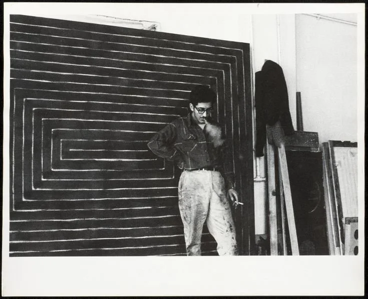
Turkish Mambo, 1967, Frank Stella
Black series I & II - Critical Review
“Created during 1967, the Black series II is a collection of eight lithograph prints that echo elements of Stellas’ larger monochromatic Black paintings (completed 1958-1960 in Black series I). The prints were created as an intimate ‘log’ of his earlier work, not directly reproducing forms from the Black Paintings, but alluding to similar characteristics of repeated pattern and direction. Like the Black Paintings, they consist of directional black stripes within a certain perimeter, but ultimately diverge in general appearance as the application of the lithograph marker leads to a more defined and regulated pattern, thus creating a more intense sense of optical design than the hand-marked paintings.
They are visually unified in composition; rectilinear sections of metallic black ink are positioned in the lower left quadrant of the piece, creating an immediately distinctive series. This allows the geometric figures to directly relate to the whites of the paper through unpainted sections, identifying with traditional compositional figure-ground relationships, unlike his Black Paintings which could assume an almost object-like quality.
Created as a record of his earlier Black Paintings, the prints were seen as transpositions of the ideas and gestures in them, as opposed to direct copies. They encompass a more intimate and structured showcase of logic and order through pattern.”
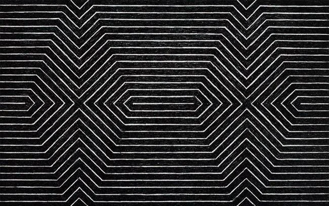
Black series I & II - Turkish Mambo
“This lithograph print is part of the portfolio Black series II from 1967, and is an edition of 100. Turkish Mambo sits in a series directly based on Stellas’ earlier groups of prints – ‘Star of Persia’, and ‘Black series I’. The Black series II prints are mostly formulated from diamond patterns created by black and white directional planes. This sense of ‘optical qualities’ is enhanced by the materials used; bright white paper and French Charbonnel black ink. Turkish Mambo in particular is immediately tripartite in composition, and with closer inspection is divided into many sections of shape, alluded to by directional lines.
These imagined shapes that create optical illusions are suggested through line, and follow the ideology of the gestalt principle of continuity. It has a central focus, while maintaining a lateral direction through line, allowing the composition to feel balanced and stable.”